Sunday, 21 December 2014

Alexa Meade


This video introduces this inspiring artist perfectly, I think it's an innovative spin on the way artists are taught to paint, to embrace the medium and no longer make it look photorealistic, but this pushes these limits by using the body as a canvas. It makes for a really clever optical illusion. I think she could really push this further by doing more moving image work with it, I feel like there's a story to be told behind this portraits.


I think it not only pushes portraiture but also installation art. As you can see above these are really large scale, I think it'd be really cool to see them in person because you'd get a completely different sense of the scale and the art work than from the photographs. I think it's interesting that they are only a painting for a fleeting amount of time, it's not like the Mona Lisa where you can hang it in a gallery forever.

Whilst I was looking into her, I discovered she had done a seven minute TedTalk. I found it really interesting to gage more about her, I found it especially interesting to discover that she did politics at University, and painted shadows that set off her painting career. I think she was brave to follow her project and instinct and move back home and I'm really happy for her that thing's are working out really well, I think there's a lot more she could push her creative practice, and I think it will be really interesting to follow her in the future and see where it leads her.


She talks about Timmy (photographed above) and how he was willing to model in everyday environments, I really like the composition and lighting in this still and how the scene is set, I think it's something she clearly has a natural gift for, and this looks like it would make a really exciting scene in a film. I really hope one day she does make one.


Alexa currently lives in Los Angeles, CA and travels the world creating art installations. She works on commissioned portraits and sells limited edition prints of her artworks. On the side, Alexa is currently transforming her home into a "Fun House," collaborating with magicians, working on a line of toys, and teaching visually impaired adults at the Braille Institute how to make papier mache.
http://www.alexameade.com/c-v/ 


http://webneel.com/webneel/blog/25-incredible-and-realistic-pop-out-paintings-alexa-meade-inspiring-showcase

http://www.alexameade.com/

Saturday, 20 December 2014

Naren Wilks, Music Video


How amazing is this circular rig, this kaleidoscopic music video, almost looks like animation but it's so smoothly filmed. I just wanted to included it because I really liked it.


http://petapixel.com/2015/01/03/trippy-music-video-made-circular-rig-16-dslrs-clever-editing/

Tuesday, 9 December 2014

Skwigly - Le Petit Prince


This is super exciting, I came across this whilst routing through fresh movie trailers to keep up to date on what's due to be released soon, and saw no one else had covered it yet, so decided to write just a few words on it because I feel that this is going to be a big underground hit when it comes out. What I love most about it is how many different techniques of animation it uses and how cinematographically beautiful it looks. The little prince has sold 140million copies worldwide, it's supposedly one of the best selling books, it's destined to do well because it's already based on a great narrative. I am super duper excited for it. I found this easier to write up about because I was so engaged with the trailer myself, and I was amazed how much of a difference this made, also not a lot of other people had written about it so I didn't have to look for things to say that everyone else has already said so this was much faster to whip out.

http://www.skwigly.co.uk/le-petit-prince-first-trailer/

Thursday, 4 December 2014

Jeremy Mann Paintings


Jeremy Mann(b. 1979) graduated from Ohio University with a Cum Laude degree in Fine Art-Painting. Afterward, he ventured out to California where he earned his MasterÕs Degree with Valedictorian honors at the Academy of Art University in San Francisco. Since then, Mann has garnered substantial attention in the art world. Praised by critics and collectors alike, his work recently graced the cover of American Art Collector magazine.
http://www.johnpence.com/visuals/painters/mann/

When I first started at art college I really wanted to be a painter, I like to think I've still got that talent, just not enough time to do it. I prefer to keep it as more of a hobby. What drew me to moving image was the fact that I've always loved telling stories and creating narratives. What I love about Jeremy Mann's paintings is how they immerse you and they feel realistic to be descriptive of a scene but also there's enough texture and emotion behind it to tell a story and give away a fantasy feeling. I like the fact that it isn't completely fantastical, and he uses light and tone with a set colour palette to highlight his ability to show where light falls in a scene. I think if I ever make it big and rich I'd like to buy a piece of his work for my living room. The city scapes are truly captivating and really capture the business of a city but also the isolation you can often feel once you are there.


I really like how in this one the glossiness and the blues makes it look like it could have just rained. I can really picture these moving and being an animation, I think that's another reason why they appeal to me so much. There's a really skill in the way he's designed the painting and how actually there isn't a great lot of detail but there's still a lot going on. I think if I was directing a feature film I'd see if he was interested in doing the concept art (maybe one day!!)


Here's one of his more saucier pictures, just to show he's good at portraiture too!


http://redrabbit7.com/

Wednesday, 3 December 2014

Skwigly Home.


You might think that because this is a short article with a lot of facts in it'd be a fast one to write. But I actually found this really hard, because my natural writing style, is to write as I speak. Which often can be quite subjective and Skiwgly have a very strict be objective, concise but not short and sweet it still needs to have a bit of length to it. So I often find myself arguing with the sentence construction, as this is a massive weakness for me. I'm really enjoying doing these shorter articles though because I think it is making me think about my writing a lot more, so hopefully in a few months these blog posts will improve because it will come naturally to me.

As I'm not allowed to be subjective on skwigly, I thought I would be here. I really feel for Dreamworks because they've had to drop a lot of staff recently because they aren't making as much money as they would like to. Mr Peabody and Sherman and Turbo didn't do as well as they would of liked. The future of dreamworks kind of is in how well the next couple of films do and so there's a lot of pressure on this film, and I think they are feeling it. There's an allstar line up in this film and I think that could improve it's chances. There's a lot of cute moments, that look like it could make it quite funny. I just think with the best kids animations there needs to be subtle jokes for adults too, at the end of the day it's the adults that pay for the kids to see the film in the cinema, and to me this film trailer makes it seem like the script is quite dumbed down. We don't want dumb kids, I need more intelligence in my animation to appreciate more. Not even intelligence just less patronising. I think it looks like all the best bits could be in the trailer which is really sad and I don't think we can expect great things from this film, but I could be wrong.


http://www.skwigly.co.uk/dreamworks-home-trailer-uk-cinema-release/

Sunday, 16 November 2014

Romain Laurent. French Photographer

http://www.romain-laurent.com/

Romain Laurent is a photographer and director based in New York City. From fresh, energetic portraits to high-concept ideas, Romain does it all.  He was born and raised in the French Alps, where he nutured a love of extreme skiing, and studied product design at the Ensaama National School of Applied Arts and photography at Gobelins in Paris.


Romain's Gif series of One Loop a week caught my eye with the simplicity and effectiveness of each piece. I like the isolation of motion, this is something that's very common is very visual aesthetic hand drawn animation, it makes the movement the focal point, and also makes less to draw in animation. It's weird to see it in photography because you don't expect everything else to be so unnaturally still. I think there's a beauty in these Gif's, they are very cleanly made, I think the ball spins a bit too fast in the last one, and in the flying arms it's a little jerky, when the hand flicks back up. But that's me being very nit picky. I kind of like how, they haven't been made to tell a story or a narrative of any kind, but to me they come across like they were just made to show off. I quite like that a little bit though. (if you look at the full series there's quite a few of dance movements, skateboarders doing tricks etc.)


I decided to look more into his work after stumbling across his Gif's, (quite literally on stumbleupon.com) and discovered he's also a director, of shorts. Here's the first one I watched for a music video, I'm not sure I was a big fan of the song but I really like how the camera constantly spins around, and there's so much movement across the screen, again to be a bit nit picky it can be a bit shaky but it is really hypnotic. I think the shakiness is only emphasised when the sounds off (I might of just turned it off). It really reminded me of what Yoni wanted to achieve last year.


I much preferred this video. I love how simple the idea is of the man changing clothes, but then the clothes stay in position whilst he walks away, I thought it just oozed coolness. I also really like the lighting and colour palette. I think these are things that as animation students we tend to glaze past quite quickly but in film you get time to emphasise that because the actors do most of the motion for you.  I think we need more coolness in animation, maybe we need to focus more on these types of things to get it.

Inky Mind


http://www.inkymind.com/

INKY MIND FOCUSES ON STORYTELLING, CHARACTER ANIMATION, VFX, POSTPRODUCTION AND TITLES.
THE COMPANY IS BASED IN MILAN & LONDON, IT OFFERS A COMPETITIVE EDGE AND KNOWS HOW TO WORK WITH 
CLIENTS AND AGENCIES AT ANY POINT IN THE CREATIVE PROCESS.

WE DEVELOP AS MANY STYLES AND CREATIVE APPROACHES AS THE OPPORTUNITY PROVIDES, GAINING A UNIQUE VISION. 
IT IS A MULTIDISCIPLINARY APPROACH THAT COMBINES 3D, TRADITIONAL DRAWING, MOTION GRAPHIC AND 
STORYTELLING, ENABLING ARTISTIC EXPRESSION BEYOND THE LIMITS OF IMAGINATION.


I absolutely adored this animation. The texture's are so stunning and the colour palate just makes it magical. As a short it's amazing, what blows my mind is how a short like this can be used in the commercial sense. I had to look into the people that made it, because I just want to be them. Even reading the description about themselves, words like a unique vision and storytelling beyond the limits of imagination, it's amazing, this is exactly what I want to stand for. This is definitely a studio I'm going to keep on my list for when I've finished third year to apply to.

Tuesday, 11 November 2014

Skwigly

http://www.skwigly.co.uk/minions-trailer-debuts/


I have taken up freelance writing at skwigly animation magazine, bits and bobs, as an attempt to improve my writing skills for context of practice, but also it gets my name out into the industry so it kills two birds with one stone. For my first article see the link above.

Career Track Tuesday - How To Stand out from the Crowd


How to stand out from the crowd

What is your online presence?
Your professional digital footprint?
Other Social media, Blogs RSS
Resources.

Social media is good to market your business, or get yourself out there, but it’s really good to find and get oppurtunities. You don’t have time to spend a lot of time on all the sites, but you need to think wheres best to spend your time. This is a skill that can be developed throughout time and some sites can be dropped and new ones will come along. 

Facebook: 
Can use a page to promote business. 
Used for social purposes. Appropriate privacy settings? 25% of people don’t have privacy settings set rightly. 
Because it’s widely use you can use it successfully to market events.

Twitter:
Easy to get dialogue with professionals. 
Easy to follow people without needing authorising. 
Instant dialogue.

Google+: 
Used in conjunction with other google apps.

Youtube:
Video Sharing website

Wordpress:
Most people in the uk use wordpress, standardised free platform. 

Instagram:
Photo sharing. Effects and filters.

Flickr: 
Photosharing

Pintrest:
A way to collect images for inspiration.

Slideshare:
can type in a topic and academics, to research a topic. Like ted talks.


Socialnomics video:


Employers in certain sectors will check your profile. You will be googled. 93% of recruiters will review a candidate's social profile before making a hiring decision.

Are you checking your name and email? Check your digital footprint.
http://www.martinwoods.me.uk/social-profile-checking-tool/

Make sure you delete old stuff. Do you want to be found?

What is your brand? What promotional image do you want people to see?
What are your unique selling points?
What do you want to get out of the world?
Transferrable skills? Confidence, communication.

LINKEDIN
professional social networking site launched in 2003.
313+ million users worldwide (Aug 2014)
30+million students and new grads
13+million users in the UK
2.9 million companies have a page on LI

CV online. But can be more than that.


Benefits
- can build a professional online presence
- add connections
- research companies, industries and grad programs.
- explore opportunities for undecided students
-learn professional networking etiquette

Aim for 100% profile completion. Include deatails of current and past jobs roles.

Everything on Linkedin is public.

GOLDEN RULES
- need a photo to be trusted by employees, think about your photo. What does your picture say about you?
- Your headline indicates who you are! If you put in key words you will come up in more searches.
"Seeking Oppurtunities" People will browse.
- Join relevant Groups.

People aren't going to connect with you unless they know you.

Never send the standardised linkedin request. Make it personal to stand out!

Careful with big chunks of text.

Build your profile, grow your network.

You can have 32,000 connections.

When blogging, employers look for quality not quantity.

Join ACID, anti copywriting in design.


Aesthetica Blinkink Studio Talk

http://www.blinkink.co.uk/


Destination Directors - those whose portfolio is so good they get clients coming to them all the time. Jack of all trades with a unique flavour.

Solution Directors - those who come up with solutions for clients to get them to like them.

Blinkink wants all their creative directors to ultimately be destination directors. To get this they encourage and put a lot of emphasis on storytelling. Especially on how they want to make the viewers feel, and encouraging the narrative to work with the viewers eyes closed, not just relying on a set of visuals, the visuals need to be the icing on the cake.

In order to get their creatives to this stage they encourage their creatives to make shorts when they don't have paid work on and use these as "bullets" when they approach advertising agencies, to pull in more paid work.

"Bullets don't need to be expensive but to be strong, have soul, say something about your directorial flair."

The speaker then went on to show videos off the website, which I had already watched in preparation of the talk. Also he showed work that's now a year old if not older (for example last year John Lewis advert and the making of) But on there website they have the latest john lewis advert and he didn't talk about the new stuff which was frustrating.

Joseph Mann's Bullet:


Keaton Henson - Small Hands from Blink on Vimeo.

They found this pulled in a lot of depressing work for Mr Mann so had him make another one, which in turn pulled in the work for the cravendale advert.


'Sandy' by Joseph Mann from Tim Allen on Vimeo.


Cravendale-Barry the biscuit boy from Joseph Mann on Vimeo.

Cravendale - The Making of Barry The Biscuit Boy Sets from Yamination Studios on Vimeo.


 It was a little bit upsetting to have spent 8.50 per ticket (I bought two and made my step dad drive) and then eight pound on parking, to have him only say this. What he said isn't actually anything I don't know. He was a little bit disorganised in his presentation style and kept going on tangents and there didn't seem to be much prep gone in to his talk before the show. I was amazed at how many people in the room (at least 60 if not more), and I felt very disappointed. I was also disappointed by the organisation the signage to York St John was appalling and the staff working were quite rude. I think I'll think twice about ever going again. It was just far more hassle than it was worth this year.


Sunday, 2 November 2014

Embroided Music video.


A music video for the band Throne in production with Channel 4 and Dazed Digital, helped funded by Kickstarter a large number of backers.

I did textiles at A-Level so I know a thing or two about sewing, now don't be fooled by this video, it's not rotoscoped and it's not hand stitched. What they've had to do is hand draw every frame and then print it through a Machine Sewing Machine. One very similar to those that do polo shirt logo's and emblems. I thought this was genius. It's animation technique is so innovative. I am also amazed at how long it is to withstand all these frames that have been printed, because that will have been a long time to wait for each one to print. I wonder how much thread they went through. When I looked into it I was able to find these super cool photos. I love seeing behind the scenes, I'd be really interested to see what the animation looked like before it was printed.


It does remind me of the Tame Impala video I looked at last year by Becky and Joe where every frame was drawn and then "coloured in" with plasticine, to make individual frames so you could see the finger marks. I love the lengths we animators go to, to find the perfect visual aesthetics. I'd love to use this technique there's just so many ways you could push it. I just wish I'd thought of it first! (also note to self remember to turn the sound off when watching ).


http://www.nicoslivesey.com/

David Szakaly


I really liked these gif's, they are hypnotic. I think I prefer the black and white ones, They kind of remind me of the music video's by Arctic Monkeys, well they weren't by them, they come from the studio BlinkInk, the one I coincidentally saw at Aesthetica. What I like about these is the simplicity of them, but they would make for a great filler in a showreel.

http://davidope.com/

www.thisiscolossal.com/2014/03/the-hypnotic-animated-gifs-of-david-szakaly/
http://www.iwantyoumagazine.com/davidope/

Tuesday, 28 October 2014

28th October

Buy ticket for BAF animation ticket, on the college shop.

7 steps to make a better mind map.
  1. start in the centre
  2. uses images and pictures as well as words
  3. use colours as they are exciting and subconsciously highlight details
  4. association, connect ideas to central image to connect thought processes
  5. used curved lines because your brain remembers curves better than straight lines
  6. use key words to make it powerful and more flexible
  7. use lots of imagery

Brainstorming
  • think of as many ideas as possible
  • encourage wild and eccentric ideas
  • resist evaluating ideas till later
  • look for associations between ideas
  • make random associations

SCAMPER
Substitute; can you swap materials and process? Start off with 3D switch to photoshop stop motion? Swap a character in the story? Change the location of the story? 
Combine; could two characters function as one? Do you really need so many characters? Can you combine the skills of other people? Combine strong pieces of concept art into one?
Adapt; reuse and recycle materials and props? Change the role of a character or a situation?
Modify; What could be emphasised exaggerated? What can be added to make it more fun?
Put to another use; could research be put into another idea? Recycling etc.
Eliminate; What can you tone done? Is there too much?
Reverse; Can roles be swapped? Look at a story back to front. 

SWOT
Strengths, 
What are you good at? 
weaknesses
Gaps in knowledge, timescales, commitment, reputation, planning.
opportunities
What are you going to get out of it? Networking, partnerships, able to new learn skills
threats

Time management, competition, perfectionism

Monday, 27 October 2014

Planning Ahead


So I've been doing some idea generation on how I can start getting my work out there into the public and make a few bob and I've thought of something that could work really nicely with this new PPP brief of refining and practicing a skill under fifty hours between now and submission that could potentially be put out there. 

At first my initial idea was to do life drawing because I went to a class last week and here were my outputs.


So we started with a couple of minutes to do a continuous line drawing of the figure. I really don't enjoy doing these, just look at how skewed my proportions are, it looks terrible.


Then we had to do sixty second action shots which were really about getting the key lines of the body in. I read this article the same day I went to this which I think really made an impact on these drawings about how the body has one main flowy line through it which is always over exaggerated in traditional animation.


Then we had a couple of longer drawing tasks to do which I just don't like the outcome of my work for I think proportion is something that I really need to work on. But what was encouraged in this workshop was the use of textures which is why we had the metal cage and scrunched up newspaper is the pose above to try and encourage mark making and textures, but I think it's difficult to get them through in pencil and crayon we had really basic materials I think it's something that would need to require chunky pens and ink and thick paint if you're going to cover textures.


Finally the forty minute pose left me in a rather unfortunate position, but i tried to embrace the charcoal and come up with something that feels textured. I just don't think it has the feeling of skin it looks more like the same texture and wrinkles that you'd find in a scrunched up paper bag. However saying that I think I am my worst own critic but this is definitely an area as an animator I need to improve. Which is why this was my initial idea for the 50 hours, but here I spent three there and paid £10 and so I just think it would be quite expensive to do this in the time frame we have. So it's something I am going to try go to monthly because I think it's just so important to have decent perspective and proportion and drawing skills and it's something I've really lost this last year because I never force myself to do it properly like I used to. So instead of life drawing I'm going to keep it to drawing on the whole.

The project I'm going to set myself is to do big A2 drawings possibly A1 if I can get decent paper that size of landmarks in Leeds. I'm going to aim for 10 thinking five hours on each but this might have to adjusted because I'd rather have less but more time put into them if they need the time and then I'll also get them printed at postcards and see if I can sell them as well at the Tourist Centre and places because I think we actually get a lot more tourists than you'd realise and there's a big market for postcards. 

So if you go back to the big note at the top that's actually a rough draft of what I want to explore as part of my creative practice because I don't really want to be just an animator I don't mind have my fingers in all kinds of pies. 

So I know we have PPP tomorrow but to step into sync with this my Plan of Action to take this forward is to go around and take loads of photographs of the landmarks and thumbnail different angles and record them. And to also to look into a couple of different people and see what they sell their work on and begin to analyse prolific websites that are catchy because I think that also needs to be my next step setting up a really nice website.

UPDATE:
So we are required to do a swot analysis to justify the area we want to spend developing during PPP.
InternalExternal
StrengthsWeaknessesOpportunitiesThreats
 Improve drawing skills, perspective and proportions. Quality of Line.
Will influence other animation project that require a lot of drawing, especially responsive with competition briefs, storyboarding etc.
Potential to use them as backgrounds for a short animation at the end as well.


Time management. They're a lot of briefs on and this has potential to turn into a large project to have a go at. Also includes a lot of planning in promoting and getting them out there.


Opportunities to have them made into postcards and sold on in and around town. And explore Transmedia outputs.

Can develop portfolio around this make website and business cards, network, and actually have products to sell.

Also will end up with large pieces of work for pop-up show.
Perfectionism could ruin outputs and have me put off making them into postcards.


Sunday, 26 October 2014

Alexander Khokhlov, Photography


Alexander Khokhlov and Veronica Ershova is a photographers duo world renowned for it’s creative projects. Unconventional ideas and daring approach to common shootings are their calling card.


2D or not 2D?
Most talked-about series Weird Beauty and 2D or not 2D were created in collaboration with famous russian make-up artist Valeriya Kutsan. Mix of face art, photography and post-production allowed to create optical illusions. 2D or not 2D series were included in Designcollector’s top-10 of Russian projects in 2013.

Optical illusion photography is something that has always mesmerized me, it blurs the lines between art direction and real life, I think it could push animation, because as animators we always say what's the point in doing this animated when it could be done in live action, if that's the case then there is no point. By looking at optical illusion photography you can see what aesthetics would be capable in live action. I also think that they always have really nice compositions and lighting techniques that could inspire my work.

I think it's interesting that this couple did an exhibition that was amazingly colourful and then there next was Weird Beauty was striking in comparison in Black and White. The diversity of their photography style even though they specialise in portrait pieces pushes itself as will continue to do so.


Weird Beauty

In this collection of photo's (bare in mind, I only chose a few from each selection there is an overwhelming number to look at, all visually striking), the lightening face is the most captivating to me. It's so cool how flat the lightening bolt looks.

I think it's important to recognise at this stage that it has come about from a collaboration with a top makeup artist, and I think as photographer's they could of pushed themselves more. I appreciate that they were really trying to push the emphasis on the make-up but from a photography point of view, I much prefer the compositions in the series White Garden.


White Garden

I feel like by this selection of work as photographers it's really matured. I like the space around the focal point. I only think they could of done more in the art side, the white paint on the bodies looks a bit patchy. Their could have been more detail in the flowers. I like it because it explores fantasy themes and it's real life but it's a bit magical. I wonder what the male equivalent of White Garden would be, Black City?


http://www.alexanderkhokhlov.com/

Richard Swarbrick


I love the visual qualities of this animation, and in fact all his work (included a screen shot of his portfolio on his web page so you can see it's all in this style.). It's simple, there isn't actually a lot on the screen, but the paint brushes in the people and in their faces are really complicated. This is something I am so envious of. It's something that's always bothered me that I haven't been able to manage during first year, is getting the simple side of things without overdoing it.

Now I couldn't find any information on the production of these animations, and after watching it few times, I feel like it might have been rotoscoped. Which makes me a bit sad, because if that is the case he hasn't actually added anything else to the scene to make worthwhile to be animation, except for being beautiful. I need more substance than this in my life.


With this in mind I decided to reassess his other works, and I feel empty and sad about them now. There beautiful but meaningless. He should stick to illustrations.

http://www.richardswarbrick.com/

Tuesday, 21 October 2014

PPP Briefing

PPP

Second year is critical, self inner development.

Build on the experience of level 4.

Investigate, personal professional, innovative and entrepreneurial aspects of external creative industries.

Creating a Showreel for internships, summer work etc. Web presence is about communication.

Follow the animation press.

Be aware about future technologies try and predict future trends.

Develop a body of work as well, showreel, learning journey presentation. More critical and evaluatory. 

We will look at Broadcasting standards.

Minimum of 30 Blog Posts.

Critical Incidence, is whenever you’ve had an experience about someone changing your mind about something, that requires a response is a PPP blog. If your practice is reaffirmed. 

Attend conferences and festivals.
Identify an Area of Practice you wish to research and develop further. The journal should document your enquiry with the process, and outputs and reflection on the personal development. Showcase this development of the 24 March. (Life Drawing?) Should be achievable in 50 hours.
A write up of the course Pop-Up show. 
Related blog tasks.
Continue to research on practitioners.


Don’t double up on other Modules.

Target your showreel for which company you apply for. Look at other peoples showreels. Professionals, companies, level 6.

Monday, 30 June 2014

Kseniya Simonova


About the above animation:

In the third round, at Final, the sand story of Kseniya was about parents who gave birth to a son, the son has grown up, became successful and adult and forgot his old parents. Kseniya wanted the children to remember their father and mother — people who gave them lives — and call them. The resonance was enormous — people came to her in streets saying: «After watching your story, I took the phone and called my mom. I haven’t talk to for her a year. I called my mom after your story. Thank you very much! » Simonova said that these words were more than winning the show. During the interview with the judges in super-final, she said: «I’m not sure I want to win the show. But if a single person who didn’t call his Mom, will do it after my sand story — I will be more than a Winner!»

Kseniya Simonova first got noticed in 2009 when she won Ukraine's got talent with the above piece.
She's not just a student who'se studied english folklore and shakespeare and poetry and combined it with her art she's had a really complicated finding herself period where at one stage she was attending two uni's at once. To read more about it go here http://simonova.tv/en/story.

I really love the magic of her storys the narrative aren't always coherent it sometimes takes a couple of steps for you to realise what's happening but when you do they are just so romantic.

Here her latest short with Legend's of Russia, again another sand animation:


This film is devoted to Russian legends which found the reflection in the Russian background of the artist and author Kseniya Simonova: «When I was a child, my grandma told me stories full of mystery and honest beauty, tales and songs — they grew up in my soul, even earlier than I grew up. I am Russian, it is in my blood. I have always been inspired by different Russian things — from fairy-tales to Russian ballet. Since I started working with animation, I have been thinking on creating a Russian story, a fairy-tale, full of allegory and inner sense — as I could remember my childhood. Now the time has come, and the story is ready».
The characters of the film do not have either the exact names or exact origins, as well as the action. They all became a result of an imagination of a child who grew up on the Russian fairy-tales. At the same time, the characters can be related to the psychological types of a human inner mythology, something close to Carl Gustav Jung's theory of psychotypes. The Boy who becomes a Man -- Russian Bogatyr (hero), a Beauty who was stolen and found, the Evil Spirit... The Great Helpers -- Wisdom (Owl), Love (Lady-Swan), Courage (Horse), Movement (Fish), Power (Sward), and Great Enemies -- Evil Wisdom and Evil Beauty (the Syrin Bird), Destroying (Fire, Frosen Wind), Death (The Black Horror). Despite the eternal fight and dangers, the Boy saves the Beauty and they return together to the Golden City in the sky...
The film is a drawn animation created in the technique which was invented by Kseniya Simonova -- Plastic Animation.
Kseniya Simonova is a winner of «Ukraine's Got Talent» first audition, and originally is a as live performer of sand art. This year she is trying herself as an animation director and artist, and decided to use some new technique.
The music which you will hear there was created by Kseniya's creative partners — V.O.D.A. band from Ukraine, finalists of «Ukraine's Got Talent-3».
Kseniya Simonova says: «The Fairy-Tale lives inside each of us. Believe...»

When it says it's drawn animation i actually think it's an oil based kind of crayon that shes uses otherwise it would dry. I really like the development of her work into more colour and obviously she will of had a lot longer to work on this piece because it won't have been timed and judged. Although I really love it, my main criticism would be that I think as an animation it would work so much better without the hands being visible. I think it distracts from the story, and in the one she does have it without the hands in some parts, i think she should've just taken a bit more time to do that and then they would tv quality, short films before kids shows.


Thursday, 22 May 2014

ANIMATED SELF

So for my animated self project I did a few different doodles of ideas on scraps of paper, that I have since lost. But basically I had three different ideas, the first one was to use my original PPP presentation idea with minnie but have us walking through the woods and have it all magical with particles imposed on top and magical fairies. And the snapshot of me being about how I'm away with the fairies with minnie in the woods. However I thought about this and ruled it out because there's no way I'd be able to control Minnie and I'd need another person to help film and I thought to look clean and professional I need to do it really well and do a few attempts and to be honest I wanted something that was more easy to define.

So then I thought about me making a nest out of all the stuff I've used this year to help with my work, my needs, my paints, pens pencils, glue etc. And have that as an animation, And then instead of having me build the nest why not have me in the nest like a sparrow collecting shiny objects. Or or collecting skills. I deliberated. I thought oh no, ee by gum, I've got it why not have me being born as an animator in this nest of art material goodies. But I wanted to develop it so it'd be all colourful and like magnetic movement rhythmic and pulsing at the end like my ideas are coming out of me, kind of like a sky arts ident, (the only tv channel with amazeblaze idents), but less clean and professional and more eccentric and my personality.


In the end I was at a loss on how to do it, so I chose the default brush that most looked like spilt paint and went a bit mad on making them look more "spark" like. I also added flashes to make it seem more like a mad scientist at work. And then I ended it with the thought provoking Birth of an animator or a wizard bird? I think the sound of white noise really added to the manicness of the animation. And actually as I was making it I really hated what I was making but I think with the sound it's come together better than I expected. I'm really glad I added the stars to the spinning because I think it builds anticipation to the sparks.  I'm not saying it's good enough to be shown in an exhibition. But I think it's good snapshot of me at the this moment in time and how I feel about where I stand in the industry. 

Also just a note I chose a fiery egg and the orange yellow red to mimic that of the flower that's in the shot before it zooms in, and also I had my camera set to sunny settings, I think it expresses my emotion of actually even though I'm very harsh about my work and very negative of everything that's going on, I am actually in a much happier place than this time last year. And I'm really work hard to not rely on others to make me happy and I am officially over a month smoke free and I'm exercising and people this time last year who I aren't in touch with wouldn't believe it. I've worked really hard this year even if I have left a lot of projects till the last minute. I think for next year I'm most excited about the PPP module and developing industry connections because I know by christmas I'll have enough work to not be afraid to ask for feedback and send off for commentary and showreels etc. It's going well. 

Art and Disney Princesses


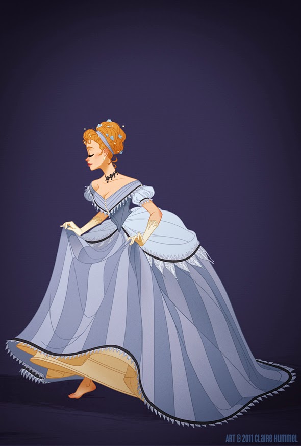
Here's two really interesting articles I've come across both relating too disney princesses. The first is from an artist, Claire Hummel, who really interested in getting the historical facts right, especially when it comes to costumes. So she's created a series of works that show Disney Princess' in accurate costume. On the whole the characters are still recognisable but there's a lot more detail in the designs. I can perfectly understand why designs would be simplified from an animators point of view, more detail just means so much more work, when they are all taken from feature length films as well I'd simplify them.
http://clairehummel.com/

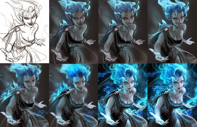
 http://www.stumbleupon.com/su/1KSU0F/:F.4d5D_z:jjgqR+Vg/geekdraw.com/2014/04/gender-flipped-disney-ghibli-characters-sakimichan/


The second article is about gender flipped disney and studio Ghibli characters. I don't think they are quite as successful as the costumes. The artist Sakimi Chan is primarily a fan artist. I think what lets thee illustrations down is how anime inspired the male characters are and therefore they look quite girly. I do however really really like the firey blue woman who I think is a female Poseidon.

I looked at the artist's work and it is primarily anime, and really it's just not my cup of tea I think it's so hard to get your own personality into anime, as a style of character Ghibli owns it, to me you can't draw your own anime character and call it original. But that's fine because Chan's work is fan art, I just really liked the concept of role reversal, I think we have to challenge all the notions that are in the animation industry and rewrite the rules and create our own revolution of what animation is.